Laravel42
Redefining our visual communication for our clients

Project goals
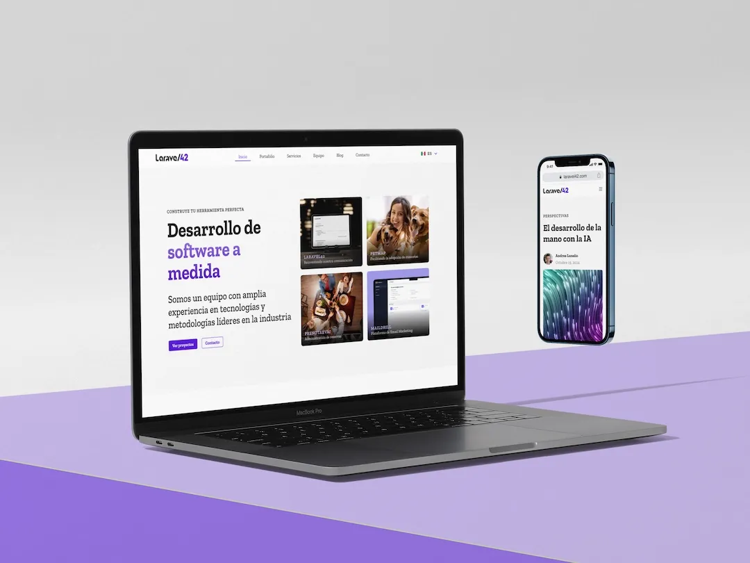
As a constantly growing team, our goal was to update our image to generate greater trust and positioning with our clients. We sought to provide greater credibility and enhance the experience of our users by standardizing visual guidelines that reflect our dynamism, adaptability, and focus on quality and personalization.
The main challenge was to redefine our visual identity in a way that conveyed our vision without losing the essence that sets us apart. Additionally, we had to ensure that this new image seamlessly integrated with our digital communication and website, providing an optimal experience for the end user.
Solution
We developed a detailed brand usage manual that establishes standardization of colors, typography, and general rules for brand construction and development. This manual ensures consistency in any application of the brand, from internal presentations to external marketing materials.
Furthermore, we implemented this new visual identity on our website. The update not only enhances the aesthetics but also reinforces the perception of seriousness and quality that we want to convey to our current and potential clients. Every element of the site was designed with the user experience in mind, ensuring that our platform is intuitive, accessible, and aligned with our values of quality and personalization.
Tech stack
The technologies implemented for the development of this website were selected to ensure efficient control through a Laravel-based CMS. This approach allows the necessary flexibility to implement design components that are easily editable in terms of content. We focused on optimizing resources and enhancing the user experience, ensuring clear communication and consistent brand visualization, merging quality development with a design aligned with the brand's vision.
- TwillCMS
- Vue.js
- Tailwind CSS
- Figma
- Adobe Suite


